Testing a beta design of a search catalog and incorporating learnings
The library was set to launch a new version of their search interface, but wanted to sanity test the interface with patrons and incorporate any learnings.
My Role
UX Designer
Teammates
Research Assistant, Program Manager, Library Scientists, Endeca Specialists, Front End Developers, In-House Illustrator
Challenges
Limited time frame and front end resources
No metrics
Methods
User Testing
Faceted Search Design
User Centered Design
Research Findings
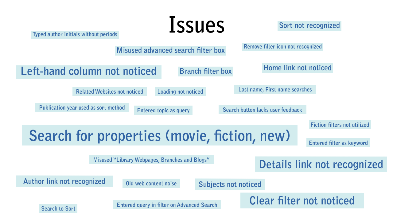
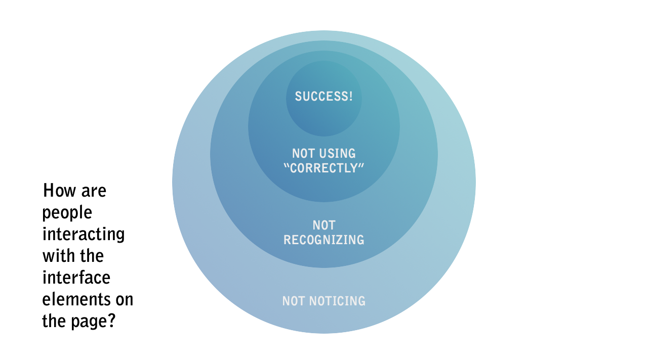
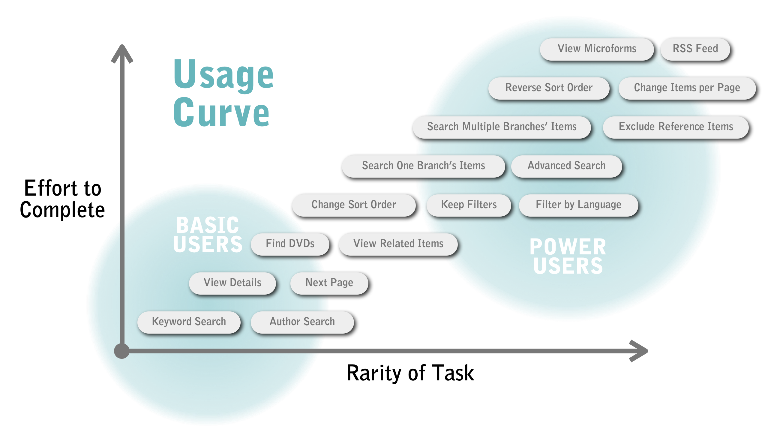
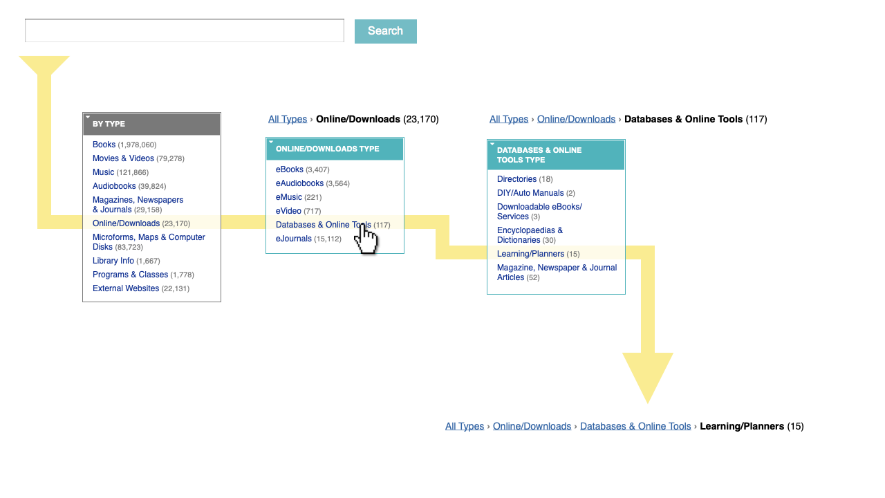
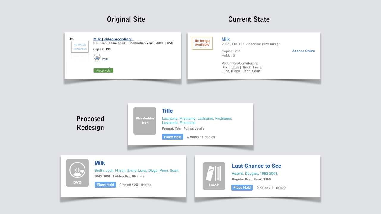
The search filters were not being reset after each search resulting in a lot of dead ends. Search results were not designed in a way that users could see or perceive correctly.
The problem and how it was solved
The library had replaced their aging catalog search with a brand new faceted search catalog powered by Endeca. They suspected that interface design had some usability issues, and wanted someone to conduct user testing with patrons in the branches, and then make recommendations.
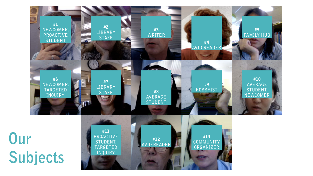
They’re a smart bunch, most of them highly educated library scientists. I was lucky enough to have been assigned one to conduct the user research and we sought out the library’s personas in person in order to observe them looking for the physical items they already had in hand.
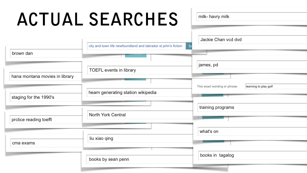
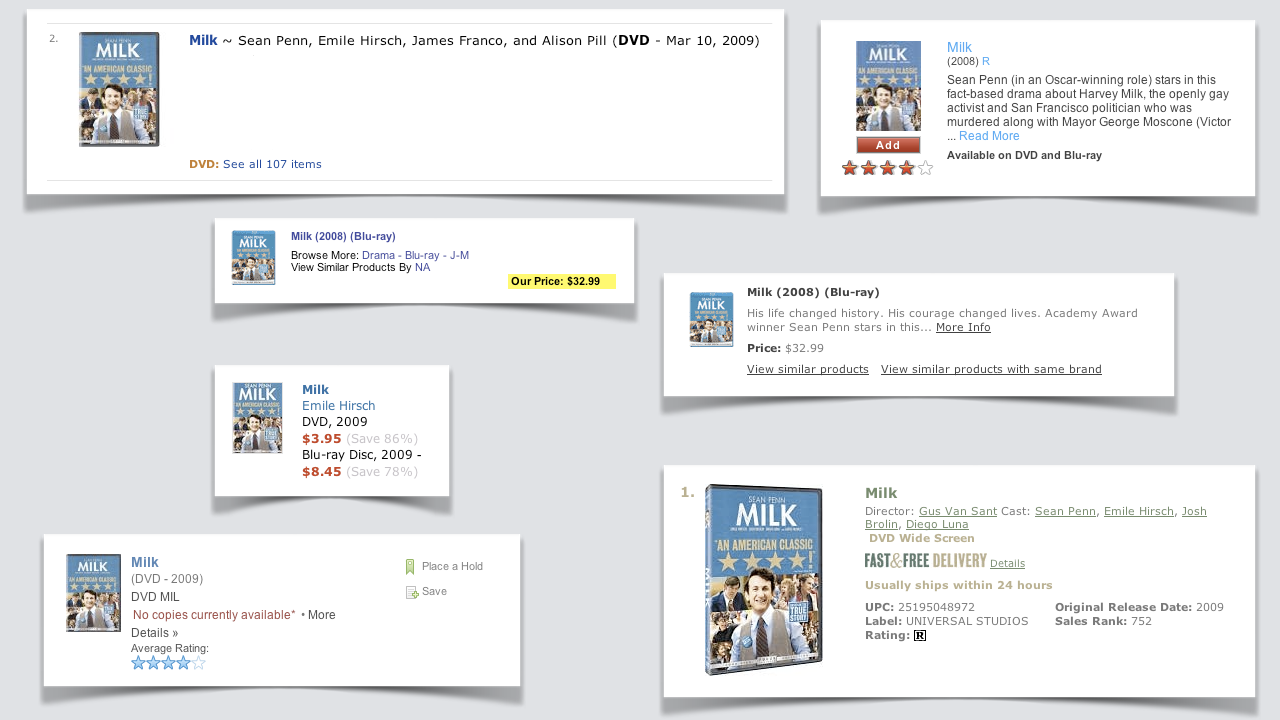
For example, one student had a DVD of the movie Milk, and we had them search the catalog for it while we observed and took notes.
Impact
For the first time in their history, a change to the website resulted in a reduce to support call volumes. This was unheard of even for small changes, and this was a massive redesign.