Take notes while you browse the web. Synced and encrypted.
A lot can happen on a web page, like an event. It’s handy to be able to take notes. This add-on was conceived after we were tasked to come up with a low-risk way to test a new sync technology. As a new sidebar extension API became available, it seemed like a good space to create a secure notes feature using the Firefox Account to sync.
My Role
Cloud and Desktop Designer
Teammates
Engineers, Android Designer
Challenges
Small team and timeframe
Lacking user research
Experiment program framework
Methods
Ideation
Quantitative User Research
Experiment
Privacy
Coding Open Feedback
The problem and how it was solved
Firefox had a problem; its Android browser was due for a major overhaul, and a core part of the product, the Sync technology, required replacement. As Sync data is fully encrypted on Mozilla servers, it’s fragile in nature. If a beta browser accesses the Sync data and sends it back with errors, it can ruin the Sync data in the account. So the challenge was to come up with a low-risk way to test the new Sync data and deploy it in the Test Pilot program.
While observing user testing over the years at Firefox, I noticed that many users keep a Google Doc open to take notes while doing online research for shopping, and other projects. They also use Docs to store passwords. 😅
Firefox had also recently launched the ability for Add-ons to appear in the sidebar, and the idea of a basic Notes app came to be.
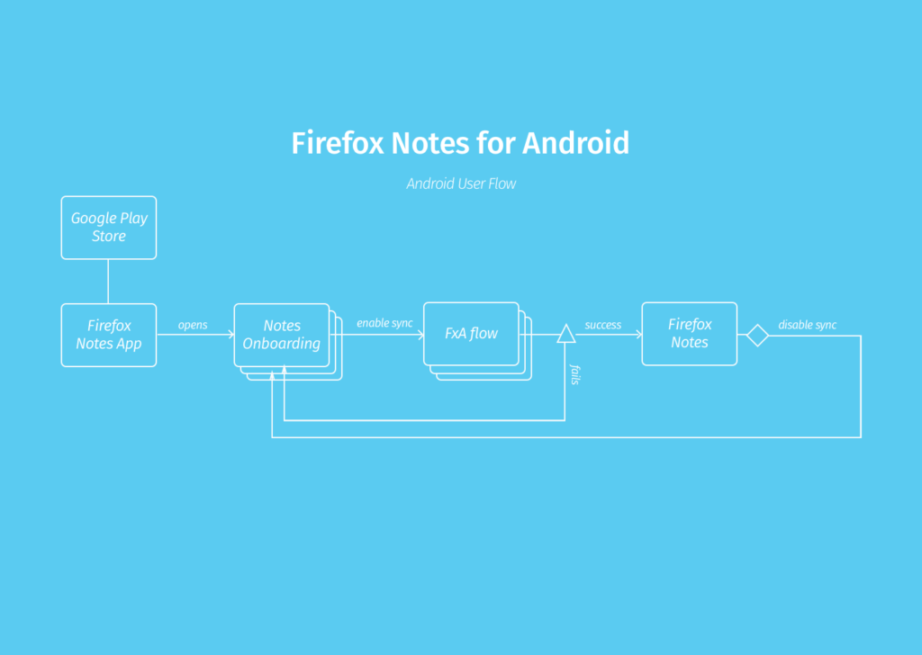
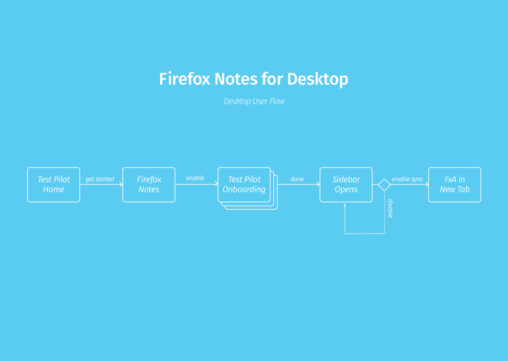
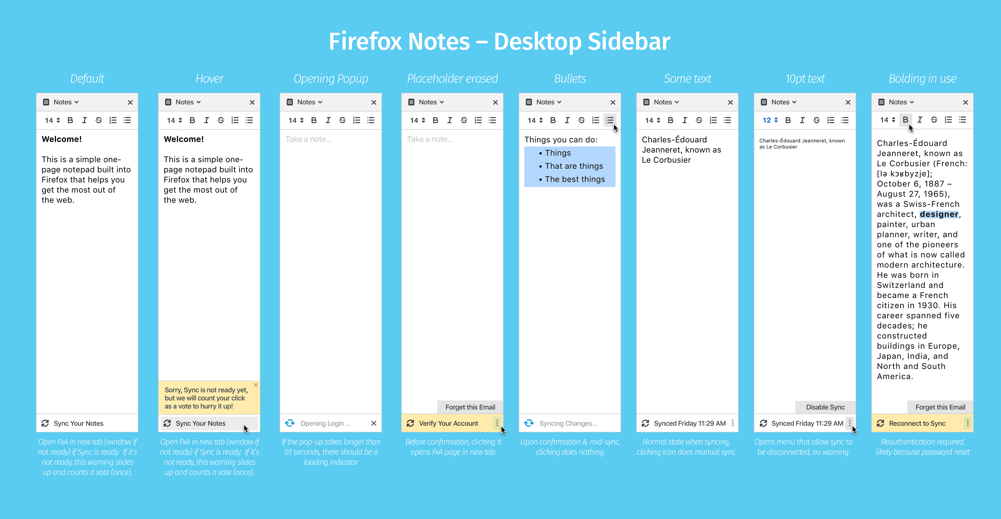
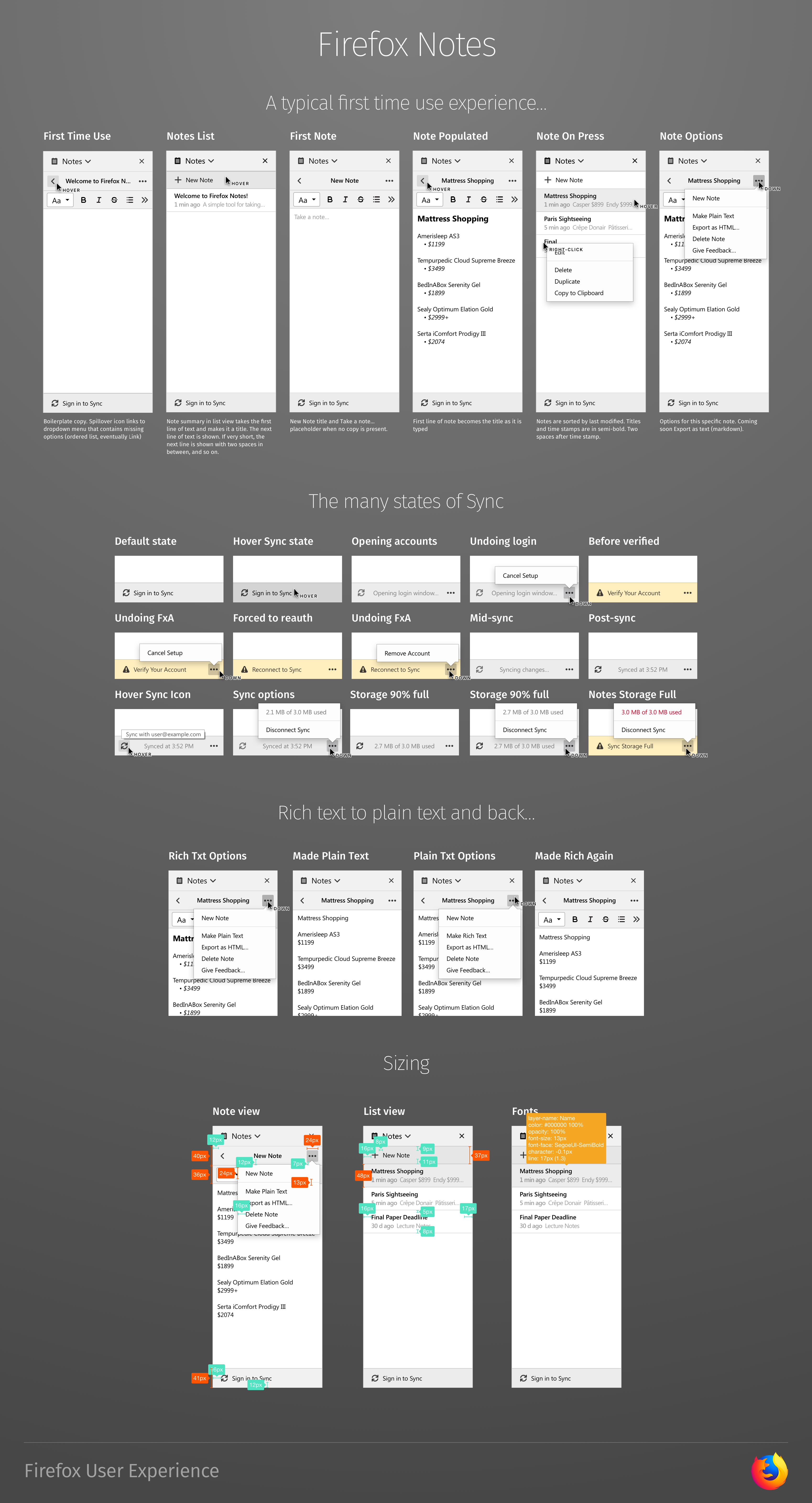
Having implemented the Sync UI on the other clients, I knew that the challenge was coming up with a design that would elegantly handle all of the cases that Sync can get in. My initial sketches were less obsessed about the text formating, and more about accommodating the cases, which ended up being 15 different states.
Foster goodwill with your developers by equipping them early with all the designs they need to handle edge cases.
After several rounds of sketches, basic flows were done for the add-on which was accessed through enrollment in the Test Pilot Program.
Soliciting and Coding Open Feedback
When soliciting feedback we started with the open-ended question:
What would you like to tell us about today? This can be anything: a problem you’ve noticed, a feature you’d like to see added, etc.
As responses poured in, we slotted the responses into these finely-tuned categories:
- Access & Discoverability
- Advanced Formatting
- Checklist
- Color / Highlight
- Dark Theme
- Email & Print
- Export & Save
- Find / Search
- Keyboard Shortcut
- Hyperlinks
- Insert / Drag & Drop into Notes
- Markdown
- Multiple Notes
- Performance & Stability
- Pictures / Screenshots
- Share & Connect to 3rd Party Services
- Site-Specific Notes
- Sync & Mobile App
We could then segment the feedback by release to see if our changes could move the needle.
Coding Open Feedback Over Releases
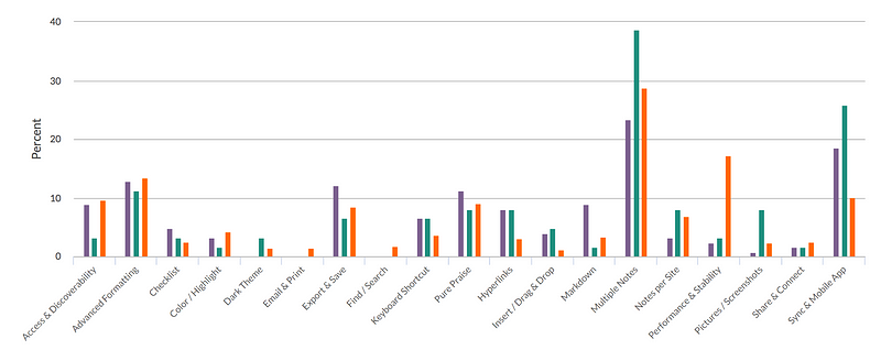
Looking at the coded feedback over three releases, we were not terribly surprised to see that multiple notes was the most requested feature, followed by Sync. After desktop syncing was released, the remaining feedback was for mobile syncing. An early surprise was for Markdown, requested by 9% of respondents. Luckily it was easily added thanks to our switch to a rich text editor that supported Markdown auto-formatting.
Unanticipated use cases reported by users:
- Students taking notes during online courses without leaving the browser
- Tasks lists for individuals with cognitive/memory issues
- Sanitizing text from the web for entry elsewhere (something we don’t support yet, but will soon when you can Make Plain Text)
What were users crying for?
- Performance— Feedback was loud and clear. When we made changes that negatively affected the performance and stability of Notes, all signals let us know. A strong reminder that we need to get off our relatively new computers, and live up to the expectation that Firefox is fast for good.
- Multiple Notes — Provide a design that supports multiples notes today, but that is extensible for search and site-specific notes.
- Sync to an Android app —Syncing between desktops satisfied about half of all requests. The remainder were for Android. One day iOS?
- Exportability — Text, Markdown, HTML.
- Hyperlinks —Auto-linking URLs, or adding links to text.
- Formatting Bar Spillover —Better accommodate the varying widths of the sidebar, and clear the path for additional formatting features.
- Plain text — Users want to sanitize text pasted from various websites, and make sure that hidden formatting is removed.
Final Design
Research Findings
By utilizing in-product feedback, were able to code open responses into categories. Surprisingly many respondents requested Markdown which we were able to achieve using a WYSIWYG Markdown editor extension called Quill. Other findings are documented here.
Impact 🎉
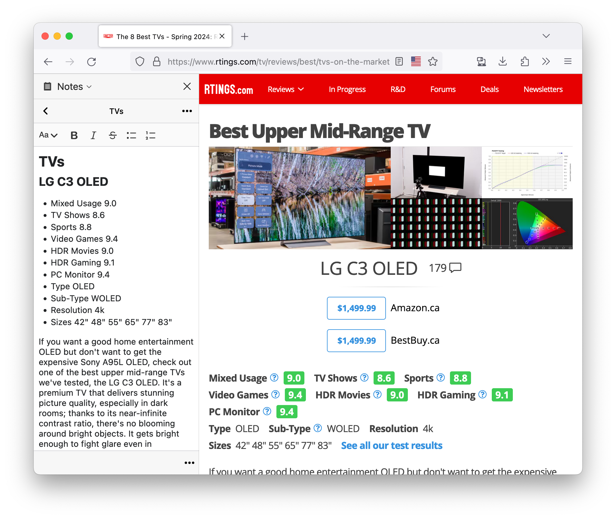
The experiment graduated to become an officially supported add-on including encrypted Sync and an Android client.